Editorial portrait styling uses clothing, accessories and grooming to help a photograph communicate before a viewer reads a caption. The objective is not to place the most dramatic garment in every frame. It is to decide what the wardrobe contributes: a colour relationship, a silhouette, a period reference, a sense of ease or a clue about the portrait’s intended character. That decision should remain clear when the image is seen as a full page or a small mobile preview.
Two recent visual-culture features make wardrobe a timely subject. Wallpaper’s 27 August 2026 Style Issue story describes clothing as a way to create a persona, while its 22 August feature on photographer Stephen Tayo examines a documentary project in which white garments carry specific religious and cultural meaning. These projects have very different purposes, but together they show why clothing cannot be treated as decoration alone. Context changes what a garment communicates.
That distinction matters when collecting references. Tayo’s work concerns the Aladura movement and challenges inherited assumptions about its white-garment communities. A Kolkata studio should not lift that cultural meaning for an unrelated fashion concept. The useful professional lesson is to research any symbol, uniform or traditional dress before borrowing it. If the team cannot explain a reference responsibly, choose styling grounded in the model, the actual brief and the setting available to the shoot.
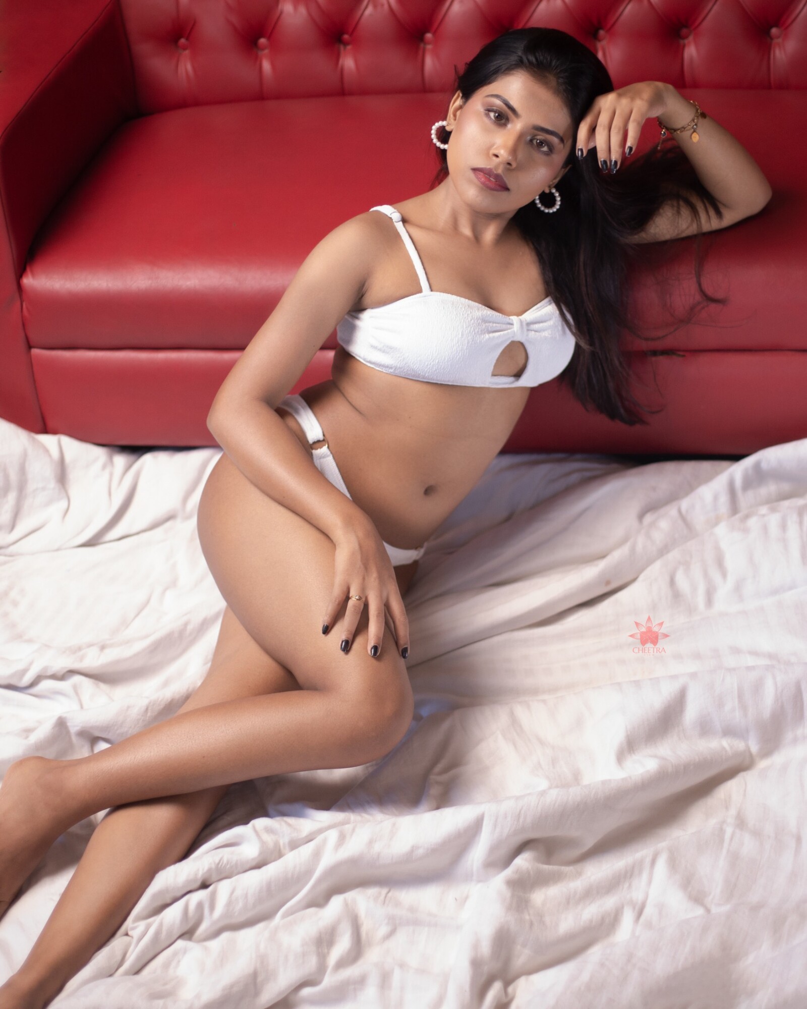
Dona’s official Cheetraview portrait provides a practical, non-cultural example. She is seated on softly rumpled white bedding in crisp white two-piece styling, leaning against a bold red buttoned headboard. Pearl hoop earrings and dark nails create smaller points of contrast. This description comes from the visible SFW photograph and the studio’s model data; it does not claim a fictional character, brand collaboration or meaning that was never recorded for the session.
Build the wardrobe plan around three visual roles. First, name the dominant colour: here, the red headboard immediately establishes energy. Second, identify the garment’s relationship to it: white separates Dona from that saturated background while repeating the bedding. Third, select one or two smaller accents, such as jewellery or nail colour. When every item competes for attention, the face and gesture can disappear. A simple hierarchy gives the photographer something concrete to protect while framing.
Check fit and movement before finalising poses. Ask the model to sit, turn and raise an arm in the approved outfit, then notice where fabric pulls, straps shift or jewellery catches. The answer is not to force the reference pose. Adjust the pose, garment or camera position while preserving comfort and agreed coverage. For boudoir photography in India, the model and photographer should also confirm which styling and crops are suitable for the public SFW website and which, if any, belong only within adults-only access controls.
Direct gesture to support the garment rather than display it mechanically. In Dona’s frame, the lifted forearm follows the top edge of the red seat, while the lower hand rests near the bent knee. Those shapes help the eye travel through the portrait. On a new shoot, make a relaxed version before asking for a stronger fashion pose. Watch fingers, wrists and shoulder tension; small discomfort often becomes more visible in a still image than it felt during the session.
The room also belongs in the styling conversation. Check whether the background repeats, complements or fights the wardrobe. A red-and-white palette can remain graphic in a medium portrait, while a wider crop may introduce extra bedding and soften that effect. Capture one frame that establishes the full relationship, one closer portrait led by expression and one clean vertical option for a model profile. This creates practical choices without changing the concept for every exposure.
Finally, keep the published path consistent. The Cheetraview homepage and lookbook show the wider cinematic portrait photography context, while Dona’s profile preserves the correct model credit and links to her collection. A public Patreon preview should use the same name, styling description and SFW boundary. To explore current public previews and available membership information, visit the official Cheetraview Patreon page when it suits you.
Current sources